
Spec Garmin Connect UX Copy & Design
The Garmin Connect app is a great resource for anyone using a Garmin watch who wants to track their workouts and hit new PRs.
My revisions----drafted in Figma----are designed to make the app more intuitive, clear, and effective.
Home Page
Original Version

Revised Version
My Day designed to pop a bit more. More obvious and eye-catching, and hopefully, more clear.
Rather than "My Day," which is vague, the home button is now labeled, simply, "Home." My Day information is still included on page, but this menu emphasizes several other features, too.

Expand button is designed to be more prominent. When the page is expanded, the app provides wonderful data, which isn't clear in its current state.
Moved the Profile button to bottom right to emulate popular apps like Instagram and Facebook. In real version, button is an unlabeled profile picture in a less intuitive place. (Top, center-left)
Profile Page
Original Version

Revised Version

Button to go to Level Page. In real app, the user's level is shown in corner of profile picture, but no additional info or context is given about levels.
Button to Badges Page designed to be more intuitive.
Keeping bottom menu on screen to emulate popular apps (like Instagram), which keep this menu open for users while on Profile page. This feature allows users to jump to other pages more easily.
Badges Page
Original Version

Revised Version

Because badges and points correspond, I've kept this points bar on the Badges Page."Next Level" bar is now more detailed, letting users know how many points they have, as well as the point threshold for the next level.
Copy designed to explain that badges are, effectively, ornamental and can't be redeemed or purchased in any way. Linked to Challenges Page so user can see challenges they can pursue. Includes option to not show this information again.
Sort button is more prominent and obvious, as opposed to the unlabeled button in top right corner of the real app.
Because leaderboard is measured in points, Leader button changed to History, which is more useful for users to track their progress over time.
Level Page
I've added a Level Page to the app, allowing users to track their progress more closely.
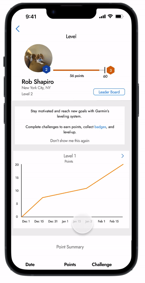

Points bar (also included on Badges Page) is redesigned to be more thorough. Rather than only saying how many points are needed to reach next level, this graph includes how many points a user has, as well as the points required to level-up.
Leader Board label now lives on the new Points Page rather than on the Badges Page, since rankings determined by points rather than number of badges.
Copy designed to explain the point system and its relationship to badges and challenges. Copy is linked to badges page. Includes option to not show this information again.
Graphs designed to show the points a user acquires over time. A user can look at summaries by Level, as well as the total. This provides more context and data for the user if they're motivated to level-up.
Points Summary window (more visible in gif above) to provide an easy way to track point development over time, organized by date, badges, and point value.